What is Studio?
Studio is the visual template builder. You design layouts here once, then content editors fill them in from the dashboard — no design skills required. Every template you save becomes available in the main Pilot feed.
Part 1 — Opening Studio
Steps:
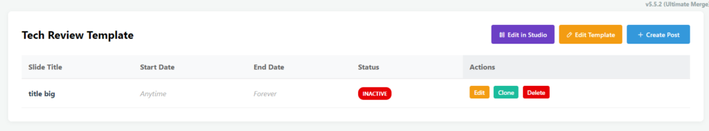
- Log in to the Pilot dashboard
- Click on a template you wish to edit
- Click on Studio on the top right
Part 2 — The Interface at a Glance
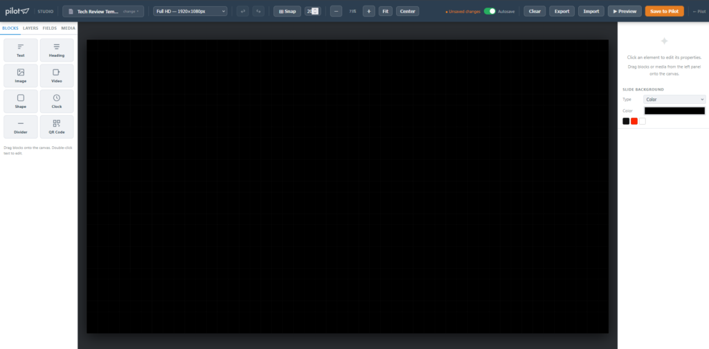
The Studio workspace is divided into four zones:
| Zone | What it does |
|---|---|
| Top toolbar | Template selector, canvas size, zoom, undo/redo, save |
| Left panel | Blocks, Layers, Fields, Media tabs |
| Centre canvas | Your design area |
| Right panel | Properties for the selected element |
Part 3 — Loading or Creating a Template
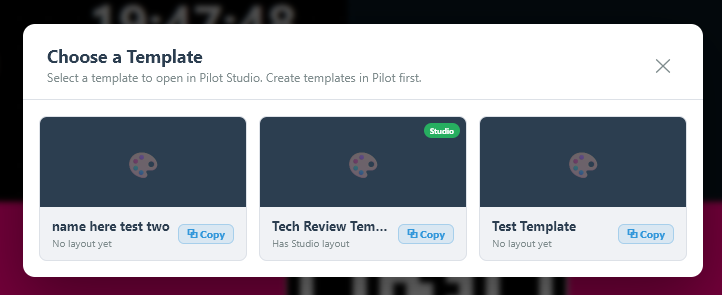
Option A — Open an existing template
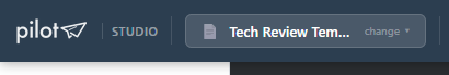
- Click the template chip in the toolbar
- Browse the list — your custom templates appear at the top, stock templates below
- Click a template card to load it onto the canvas
Option B — Duplicate a template
- Open the template picker
- Hover over any template card — a ⧉ Copy button appears
- Click it — a “Copy of …” version is immediately created and ready to edit
Option C — Import a layout file
- Click Import in the top toolbar
- Select a previously exported
.jsonlayout file - The canvas restores to that layout automatically
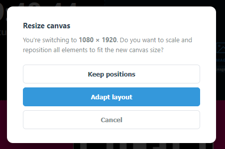
Part 4 — Setting the Canvas Size
The canvas defaults to 1920 × 1080 (16:9 landscape).
- In the toolbar, find the W and H number inputs
- Type your target resolution (e.g.
1080 × 1920for portrait) - Click Apply
- Choose Adapt layout (scales elements proportionally) or Keep positions (leaves elements in place)
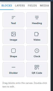
Part 5 — Adding Elements (Blocks)
All content blocks live in the Blocks tab of the left panel.
| Block | Use for |
|---|---|
| Text | Body copy, descriptions |
| Heading | Large titles |
| Image | Static or merge-tag-driven photos |
| Video | Background video or content clips |
| Shape | Coloured rectangles, dividers, overlays |
| Clock | Live time display |
| Line | Horizontal or vertical separators |
| QR Code | Auto-generated QR from a URL or merge tag |
To place a block:
- Drag it from the Blocks panel and drop it anywhere on the canvas, OR
Part 6 — Editing an Element
Click any element on the canvas to select it. The right panel fills with its properties.
Common controls:
- Position & Size — exact X/Y/W/H in pixels, or drag handles on canvas
- Font, size, colour, alignment — for text elements
- Object fit — for images and video (cover, contain, fill)
- Background colour / opacity — on any block
- Border radius — rounds corners
Alignment tools (bottom of right panel when an element is selected):
- Align to left, centre, right, top, middle, bottom edges of canvas
- Fill Width / Fill Height — stretches element to canvas edge
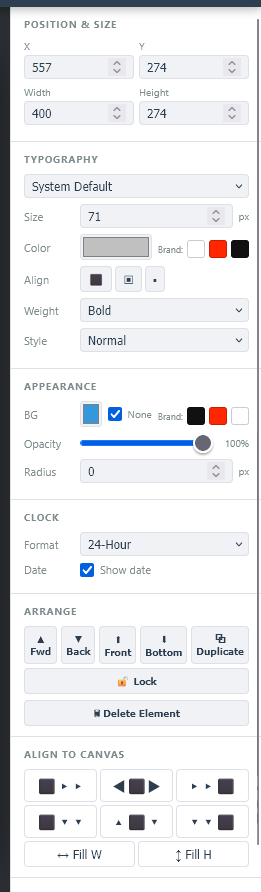
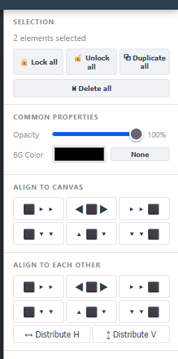
Multi-select: Hold Shift and click additional elements (or rubber-band drag across them). A multi-selection panel appears with bulk align, distribute, lock, duplicate and delete.
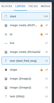
Part 7 — Layers
Click the Layers tab in the left panel to see every element stacked in order.
- Drag rows to reorder
- Click the eye icon to show/hide an element
- Use ▲ Fwd / ▼ Back / ⬆ Front / ⬇ Bottom in the right panel to change stacking
Part 8 — Using Merge Tags (Dynamic Content)
Merge tags let content editors fill in real data when creating a post — Studio just defines the layout.
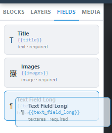
Step 1 — Open the Fields tab
Click Fields in the left panel. If a template is loaded, its defined fields appear here.
Step 2 — Drag a field onto the canvas
Each field appears as a draggable chip. Drop it onto the canvas — Studio places a correctly-typed block (text, image, video) with the merge tag {{field_name}} already inserted.
Step 3 — Or type a merge tag manually
Select any text block → in the content input on the right panel, type {{your_field_name}}. At display time the player replaces it with the editor’s input.
Common merge tags:
{{title}}— slide headline{{body}}— paragraph text{{image}}— photo from media library{{city_name}}— used by the weather template{{rss_feed_url}}— used by the RSS template
Part 9 — The Media Library
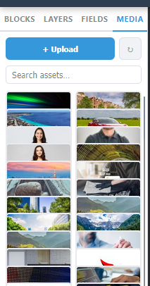
Click the Media tab in the left panel to see all uploaded files.
- Click + Upload to add images or videos
- Use the search bar to filter by filename
- Drag any asset directly from the Media tab onto the canvas — Studio auto-creates an Image or Video block sized to the file
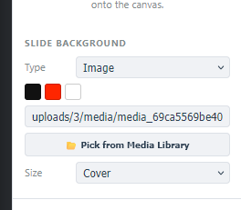
Slide Background: In the right panel with nothing selected, find Slide Background. Set a solid colour, or click Pick from Media Library to use an image or video as the full-slide background.
Part 10 — Snap & Grid
- Click ⊞ Snap in the toolbar to toggle snap-to-grid on/off — elements will lock to the nearest grid line when moved or resized
- Use − / + / Fit to zoom the canvas view in and out without affecting the output size
Part 11 — Preview
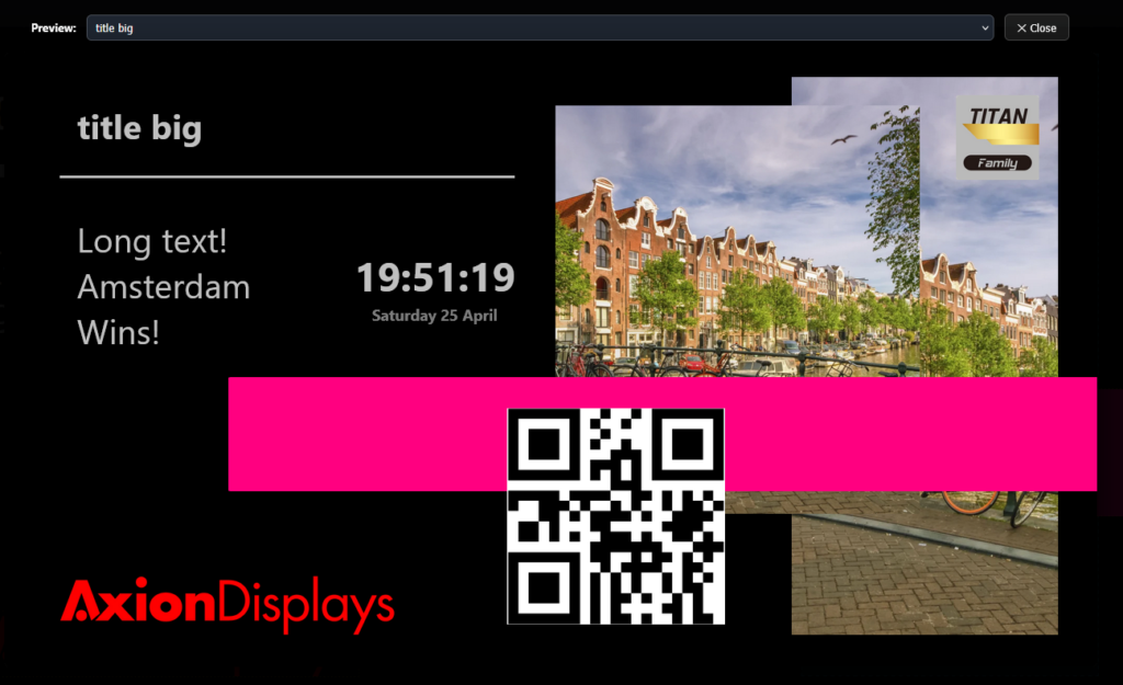
Click ▶ Preview in the toolbar (enabled once at least one element is on canvas).
A full-screen preview opens showing exactly how the slide will look on screen, with live clock ticking and merge tags shown as placeholders.
Click ✕ Close to return to editing.
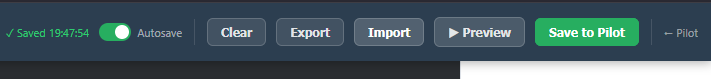
Part 12 — Saving to Pilot
When your design is ready:
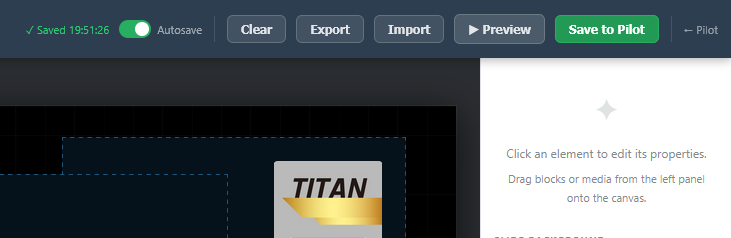
- Click Save to Pilot (green button, top-right of toolbar)
- Studio exports the layout as HTML/CSS and saves it to the template library
- A confirmation appears — the template is now available in the main dashboard
Export / Import (backup):
- Click Export to download the canvas as a
.jsonfile — useful for backups or moving templates between accounts - Click Import to restore from a
.jsonfile
Part 13 — Keyboard Shortcuts
| Shortcut | Action |
|---|---|
Ctrl+Z | Undo |
Ctrl+Y | Redo |
Delete / Backspace | Delete selected element |
Ctrl+D | Duplicate selected |
| Arrow keys | Nudge selected element 1 px |
Shift + click | Add to selection |
Ctrl+A | Select all |
Summary — Typical Workflow
  → Create a template in Pilot
  → Add the dynamic fields in the template creator
  → Open the Template in Studio
  → Pick template
  → Set canvas size if needed
  → Drag blocks onto canvas
  → Style each element in right panel
  → Add merge tags via Fields tab for dynamic content
  → Add media from Media tab
  → Preview
  → Save to Pilot